The Tonal Flower Trend: Bouquets in Subtle Gradations
One colour family, many nuances — why tonal is this season's most modern look, and how to nail it without floristry training.
Tonal is everywhere right now: a bouquet that plays a single colour family — from pale to deep, from matte to silky. It reads as more expensive, calmer and more grown-up than the colourful mixed bunch. The trick isn't pricey material, but a trained eye for gradation. That's exactly what we'll show you here.
What “tonal” actually means. Tonal doesn't mean “everything in one colour” — that would look flat and dull. It means: a single colour family, but across many gradations. Florists use three terms for this. A hue goes lighter with white (a delicate pink), muted with grey (a dusty, refined mauve) or darker with black (a deep burgundy). Combine all three variants of one colour and you get depth instead of monotony. That's the whole magic.
1. Pick one lead colour — and stay honest. Choose ONE colour family: pink, peach, lilac, butter yellow or white-cream. The urge to add “just a small accent” in a foreign colour is strong — and almost always the mistake that tips the look over. Tonal lives on discipline. Better one more gradation of the same colour than a stray spot of another.
2. Mix three brightness levels: light, mid, dark. This is the single most important rule. Within your lead colour, take one very light bloom, one mid and one clearly darker. For pink, that might be pale ranunculus, a mid peony pink and deep dark accents. This light-to-dark slope gives the bouquet dimension — the eye travels instead of stalling on a flat plane.
3. Texture replaces the missing colour. In a colourful bouquet, colour creates the tension. In a tonal bouquet, texture has to do that job — which is exactly why tonal arrangements feel so refined. Combine different bloom shapes: a round, densely packed flower next to a simple open cup, plus something fine and floating. Velvety next to silky, large next to delicate. The fewer the colours, the louder the surface speaks.
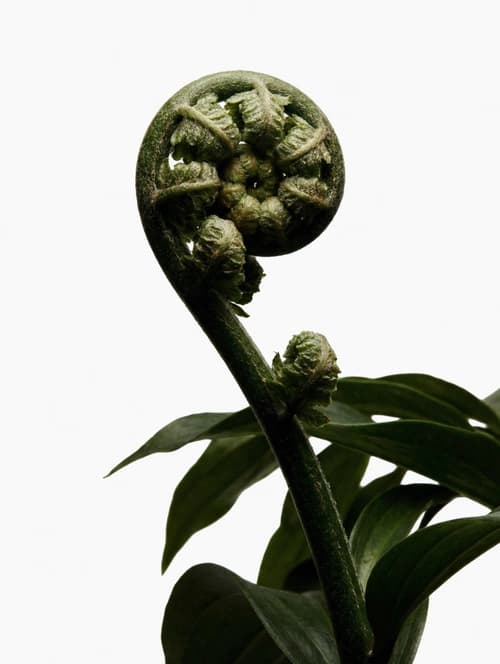
4. Green isn't neutral — it's a tool. Many leave greenery out of a tonal bouquet entirely, afraid it will disrupt. Wrong. The right green is what makes the lead colour glow. Silvery-grey foliage like eucalyptus cools a bouquet down and suits pale, cool tones; lush glossy green like ruscus adds structure and elegance to warm nuances. Used sparingly, the green frames the colour rather than competing with it.
5. Season beats assortment. Tonal is easiest when you work within whatever is in season — then you'll find the same colour across several varieties and ripeness stages side by side. In spring, tulips, ranunculus and hyacinths carry one colour family through many nuances; in summer, peonies, dahlias and hydrangeas take over. Freshly cut stems of one ripeness stage also age more evenly — ours arrive each morning from Veiling Rhein-Maas, so a tonal bouquet stays cleanly graded even after days.
6. The most common beginner mistake: too little contrast in brightness. When a tonal bouquet looks “somehow boring”, it's almost never down to too few colours — it's because every bloom is equally light. Three pastels side by side blur into a grey mush. Dare to use the dark step: one or two genuinely deep blooms are what give the whole bouquet its anchor and let the delicate tones glow.
Frequently asked
- What's the difference between a tonal and a monochrome bouquet?
- The terms are often used interchangeably but carry a nuance. Monochrome strictly means “one colour” — say, all white. Tonal is a little freer: one colour family across several gradations, from pale through mid to deep. In practice almost every successful “monochrome” bouquet is really tonal, because without brightness steps it would look flat.
- Which colour works best for my first tonal bouquet?
- White-cream and pink are easiest, because they come in the widest range of gradations — from soft cream to deep burgundy. Peach and lilac are slightly trickier, as the transitions sit closer together. More important than the colour itself is finding three clearly distinct brightness levels.
- Is a tonal bouquet more expensive than a colourful mixed one?
- Not necessarily. Tonal looks more high-end but doesn't cost more in material — you often work with fewer different varieties. The “expensive” impression comes from discipline and gradation, not a surcharge. Mind enough brightness contrast and a few texture changes, and you get the designer look at a normal bouquet price.
- How many different flower varieties do I need for the effect?
- Three to five varieties are plenty. What matters isn't the count but the range: a light, a mid and a dark gradation, plus at least two different bloom shapes for texture and a little green as a frame. More varieties don't make the bouquet more tonal — just busier.