Monochrome Bouquets: Tone-on-Tone with Impact
One bouquet, one colour — and never boring. How to pick varieties, textures and shades so tone-on-tone reads as elegant, not flat.
A bouquet in a single colour sounds like restraint — it's the opposite. Remove colour as a variable and form, texture and shade step forward, which reads as expensive and considered. The most common mistake: buying five varieties in the exact same hue and wondering why it looks flat. This guide shows how tone-on-tone becomes elegant rather than monotonous.
What „monochrome“ really means. Not „everything in an identical hue“, but „everything in one colour family“ — from the lightest to the darkest shade. A white bouquet lives on cream, pure white and a hint of green-white. A red bouquet spans from bright coral to near-black burgundy. This tonal scale within a single colour is what keeps the eye moving and creates depth.
1. Fix three shades — light, mid, dark. Before buying a single flower, set the range. Pink, for example: soft powder pink, clear mid pink, deep dusty rose. The light tones make the bouquet airy, the dark ones give it weight. Drop one of the three steps and the result looks either washed out or one-dimensional.
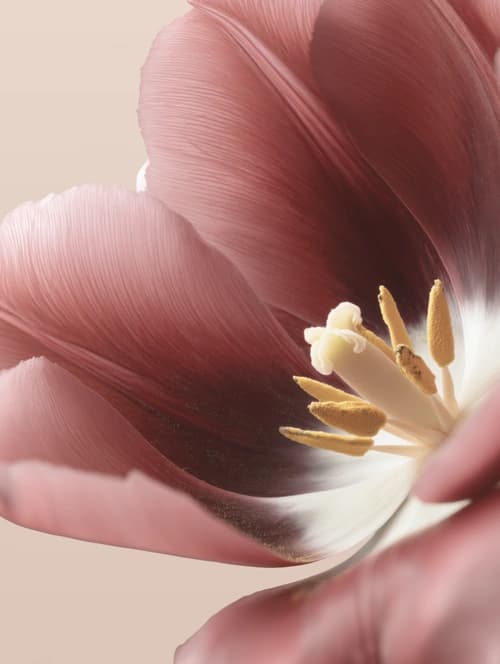
2. Mix three flower forms — round, star-shaped, delicate. This is where the real tension comes from. Combine a round, dense focal bloom (ranunculus or peonies) with an open, star-shaped form (anemones, asters) and a fine filler or veil element. Same colour, three silhouettes — that's the trick that brings tone-on-tone to life.
3. Use texture deliberately. A velvety bloom next to a smooth one, a rough bud beside a silky corolla: within one colour, texture becomes the lead. Greenery counts too — silvery eucalyptus cools a white or blue bouquet, glossy ruscus gives warm tones structure and depth.
4. Varieties by colour — proven picks. White: tulips, anemones, ranunculus, lily of the valley, hydrangeas. Red to burgundy: tulips, anemones, dahlias, asters. Pink: ranunculus, peonies, tulips, hydrangeas. Yellow/sun tones: sunflowers, daffodils, chrysanthemums. Blue/violet: anemones, hyacinths, lilac, cornflowers, lavender. Pick two to four varieties per bouquet — more turns busy, fewer turns dull.
5. Season beats colour loyalty. A monochrome bouquet only looks effortless when the varieties are in peak season — then they're top-grade fresh, strong in tone and affordable. In spring, tulips, daffodils, ranunculus and anemones carry every colour family; in summer dahlias, hydrangeas and sunflowers take over; in autumn asters and chrysanthemums. Tone-on-tone forced against the season gets expensive and loses freshness fast.
6. The symbolism behind it. One colour carries one message — and monochrome amplifies it. White stands for purity, new beginnings and sincerity (classic for weddings and births, but also for quiet condolence). Red is love and passion. Pink means affection and gratitude, yellow friendship and joy, blue calm and faithfulness. Choosing a single colour deliberately means giving not just a bouquet but a clear statement.
7. When monochrome pays off most. For modern, pared-back interiors, for occasions with a clear message, and whenever a colourful mix would feel too busy. A single-colour bouquet defers to any interior and instantly reads as curated. But the full effect needs genuine stem quality — cheap, quick-wilting flowers don't survive a close-up, and a monochrome bouquet invites exactly that.
Frequently asked
- Doesn't a single-colour bouquet get boring fast?
- Only if everything is the identical tone and the same flower form. The moment you mix three shades (light, mid, dark) and at least two or three different flower forms, tension comes from texture and depth alone — often more elegant than a colourful mix.
- Which colour is best for my first monochrome bouquet?
- White is the most forgiving: cream, pure white and green-white almost always harmonise, and the range is wide year-round. For more impact, go for pink or red with a clear light-to-dark span. The key is simply that your chosen varieties are in season.
- Does greenery count as its own colour, or does the bouquet stay monochrome?
- Greenery is treated as a neutral accent and doesn't break the monochrome look — quite the opposite. Silvery eucalyptus or glossy ruscus add structure and make the single main colour glow more intensely. As long as no second flower colour enters, the bouquet stays tone-on-tone.
- How many varieties should a monochrome bouquet have?
- Two to four varieties is the sweet spot. A single variety quickly looks like a field bunch; five or more turn busy despite the uniform colour. What matters isn't the count but the contrast in form and texture between the varieties.